This content is restricted to subscribers
AVM Testing and Evaluation using AVM Performance Metrics
This content is restricted to subscribers
Principles for Calculating AVM Performance Metrics
This content is restricted to subscribers
Introducing PTM™ – Revolutionizing AVM Testing for Accurate Property Valuations
When it comes to residential property valuation, Automated Valuation Models (AVMs) have a lurking problem. AVM testing is broken and has been for some time, which means that we don’t really know how much we can or should rely on AVMs for accurate valuations.
Testing AVMs seems straightforward: take the AVM’s estimate and compare it to an arm’s length market transaction. The approach is theoretically sound and widely agreed upon but unfortunately no longer possible.
Once you see the problem, you cannot unsee it. The issue lies in the fact that most, if not all, AVMs have access to multiple listing data, including property listing prices. Studies have shown that many AVMs anchor their predictions to these listing prices. While this makes them more accurate when they have listing data, it casts serious doubt on their ability to accurately assess property values in the absence of that information.
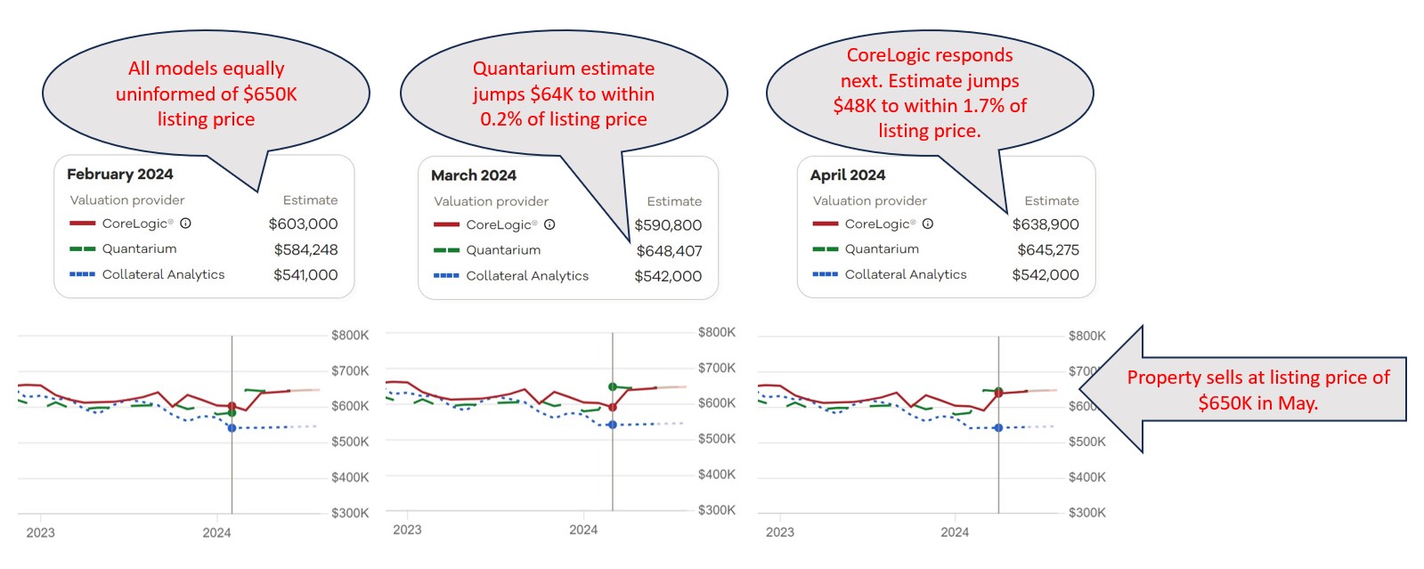
All this opens up the question: what do we want to use AVMs for? If all we want is to get a good estimate of what price a sale will close at, once we know the listing price, then they are great. However, if the idea is to get an objective estimate of the property’s likely market value to refinance a mortgage or to calculate equity or to measure default risk, then they are… well, it’s hard to say. Current testing methodology can’t determine how accurate they are.
But there is promise on the horizon. After five years of meticulous development and collaboration with vendors/models, AVMetrics is proud to unveil our game-changing Predictive Testing Methodology (PTM™), designed specifically to circumvent the problem that is invalidating all current testing. AVMetrics’ new approach will replace the current methods cluttering the landscape and finally provide a realistic view of AVMs’ predictive capabilities.1
At the heart of PTM™ lies our extensive Model Repository Database (MRD™), housing predictions from every participating AVM for every residential property in the United States – an astonishing 100 to 120 million properties per AVM. With monthly refreshes, this database houses more than a billion records per model and thereby offers unparalleled insights into AVM performance over time.
But tracking historical estimates at massive scale wasn’t enough. To address the influence of listing prices on AVM predictions, we’ve integrated a national MLS database into our methodology. By pinpointing the moment when AVMs gained visibility into listing prices, we can assess predictions for sold properties just before this information influenced the models, which is the key to isolating confirmation bias. While the concept may seem straightforward, the execution is anything but. PTM™ navigates a complex web of factors to ensure a level playing field for all models involved, setting a new standard for AVM testing.
So, how do we restore confidence in AVMs? With PTM™, we’re enabling accurate AVM testing, which in turn paves the way for more accurate property valuations. Those, in turn, empower stakeholders to make informed decisions with confidence. Join us in revolutionizing AVM testing and moving into the future of improved property valuation accuracy. Together, we can unlock new possibilities and drive meaningful change in the industry.
1The majority of the commercially available AVMs support this testing methodology, and there is over two solid years of testing that has been conducted for over 25 models.
Honors for the #1 AVM Changes Hands in Q3
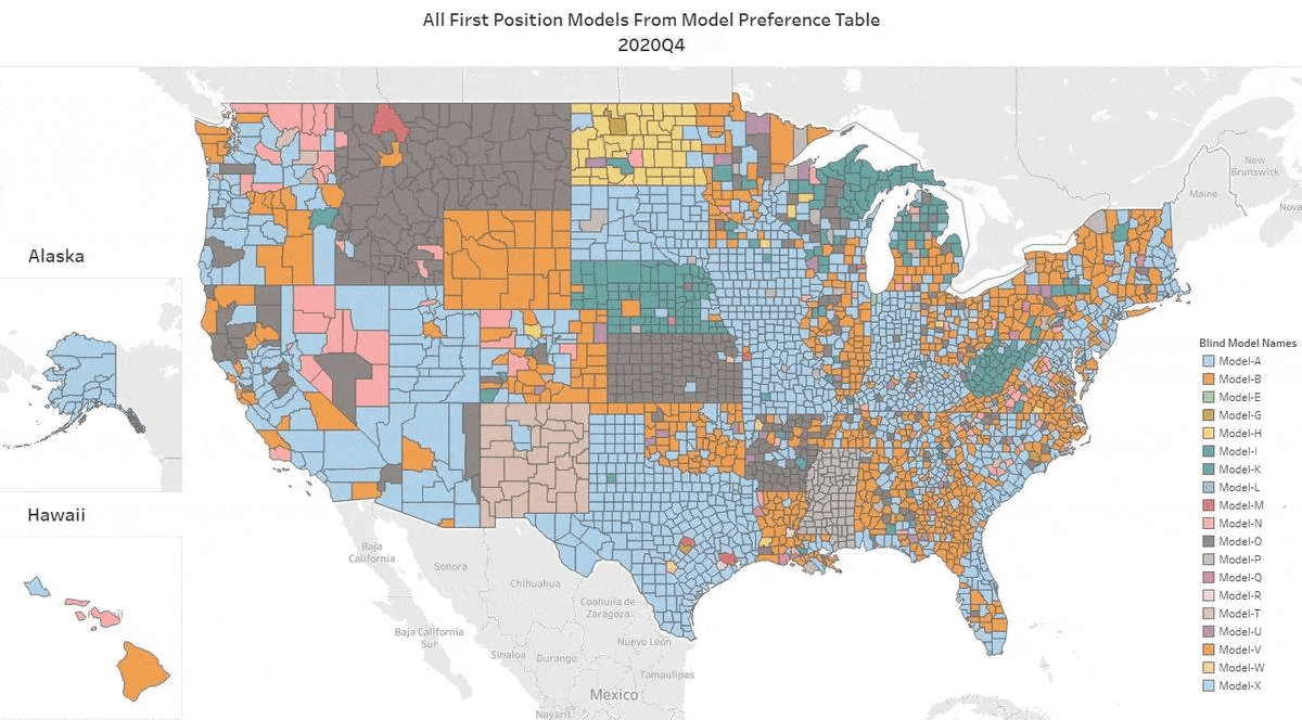
We’ve got the update for Q3 2022. Our top AVM GIF shows the #1 AVM in each county going back 8 quarters. This graphic demonstrates why we never recommend using a single AVM. Again, there are 19 AVMs in the most recent quarter that are “tops” in at least one county!
The expert approach is to use a Model Preference Table® to identify the best AVM in each region. (Actually, our MPT® typically identifies the top 3 AVMs in each county.) Or, you could use a cascade to tap into the best AVM for whatever your application.
This time, the Seattle area and the Los Angeles region stayed light blue, just like the previous quarter. But, most of the populous counties in Northern California changed hands. Sacramento was the exception, but Santa Clara, Alameda, Contra Costa, San Mateo and some smaller counties like Calaveras (which means “skulls”) changed sweaters. Together they account for 6 million northern Californians who just got a new champion AVM.
A number of rural states changed hands almost completely… again. New Mexico, Wyoming, North Dakota, South Dakota, Montana and Nebraska as well as Arkansas, Mississippi, Alabama and rural Georgia crowned different champions for most counties. I could go on.
All that goes to show the importance of using multiple AVMs and getting intelligence on how accurate and precise each AVM is.
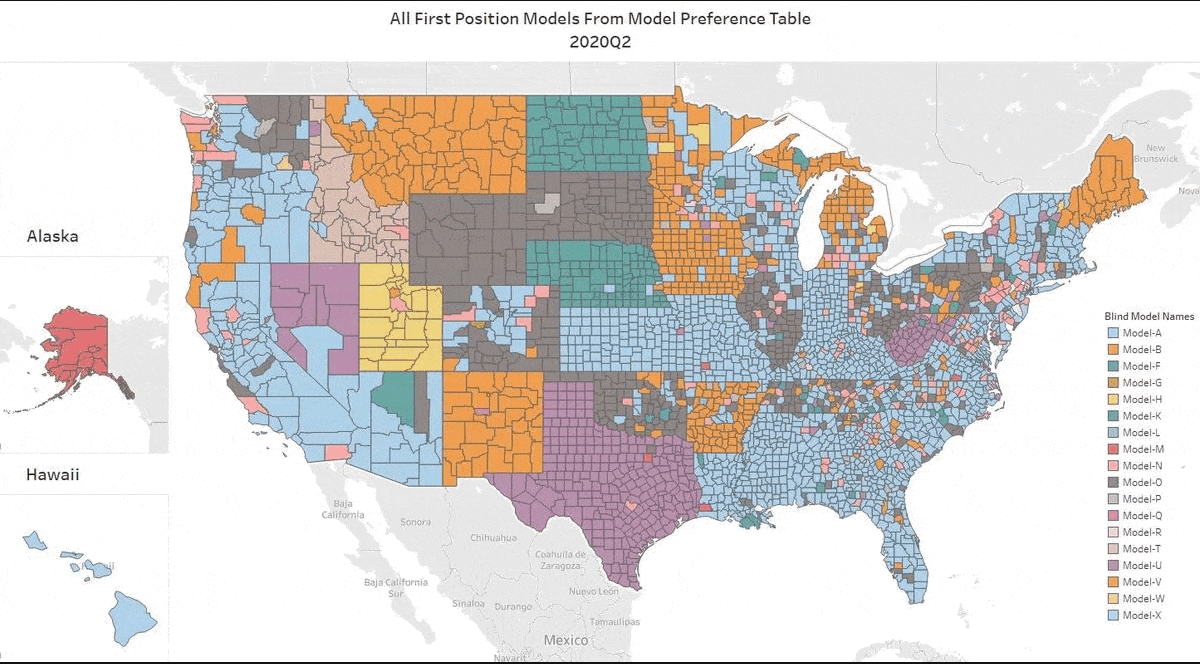
Honors for the #1 AVM Changes Hands in Q2

We’ve got the update for Q2 2022. Our top AVM GIF shows the #1 AVM in each county going back 8 quarters. This graphic demonstrates why we never recommend using a single AVM. There are 19 AVMs in the most recent quarter that are “tops” in at least one county (one more than in Q1)!
The expert approach is to use a Model Preference Table® to identify the best AVM in each region. (Actually, our MPT® typically identifies the top 3 AVMs in each county.)
One great example is the Seattle area. Over the last two years, you would need seven AVMs to cover the most populous 5 counties of the Seattle environs with the best AVM. What’s more, the King’s County champion AVM has included 3 different AVMs.
A number of rural states changed hands almost completely. New Mexico, Wyoming, North Dakota, South Dakota, Montana and Kansas crowned different champions for most counties.
All that goes to show the importance of using multiple AVMs and getting intelligence on how accurate and precise each AVM is.
Honors for the #1 AVM Changes Hands
We’ve updated our Top AVM GIF showing the #1 AVM in each county going back 8 quarters. This graphic demonstrates why we never recommend using a single AVM. There are 18 AVMs in the most recent quarter that are “tops” in at least one county!
The expert approach is to use a Model Preference Table to identify the best AVM in each region. (Actually, our MPT® typically identifies the top 3 AVMs in each county.)
Take the Seattle area for example. Over the last two years, you would almost always need two or three AVMs to cover the most populous 5 counties of the Seattle environs with the best AVM. However, it’s not always the same two or three. There are four of them that cycle through the top spots.
Texas is dominated by either Model A, Model P or Model Q. But that domination is really just a reflection of the vast areas of sparsely inhabited counties. The densely populated counties in the triangle from Dallas south along I-35 to San Antonio and then east along I-10 to Houston cycle through different colors every quarter. The bottom line in Texas is that there’s no single model that is best in Texas for more than a quarter, and typically, it would require four or five models to cover the populous counties effectively.
In the World of AVMs, Confidence Isn’t Overrated

Hit Rate is a key metric that AVM users care about. After all, if the AVM doesn’t provide a valuation, what’s the point? But savvy users understand that not all hits are created equal. In fact, they might be better off without some of those “hits.”
Every AVM builder provides a “confidence score” along with each valuation. Users often don’t know how much confidence to put in the confidence score, so we did some analysis to clarify just how much confidence is warranted.
In the first quarter of 2020, we grouped hundreds of thousands of AVM valuations from five AVMs by their confidence score ranges. For convenience’s sake, we grouped them into “high,” “medium,” “low” and “fuhgeddaboutit” (aka, “not rated”).[1] And, we analyzed the AVM’s performance against benchmarks in the same time periods. What we found won’t surprise anyone at first glance:
- Better confidence scores were highly correlated with better AVM performance.
- The lower two tiers were not even worth using.
- The majority of valuations are in the top one or two tiers.
However, consider that unsophisticated users might simply use a valuation returned by an AVM regardless of the confidence score. One rationale is that any value estimate is better than nothing, and this is the valuation that is available. Other users may not know how seriously to take the “confidence score;” they may figure that the AVM supplier is simply hedging a bit more on this valuation.[2]
Figure 1 shows the correlation for Model #4 in our test between the predicted price and the actual sales price for each group of model-supplied confidence scores. As you can see, as the confidence score goes up so does the correlation[3] of the model and the accuracy of the prediction as evidenced by the drop in the Average Variance.
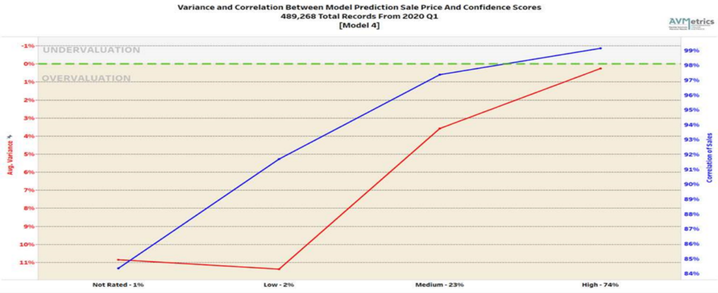
Table 1 lays out 4 key performance metrics for AVMs. They demonstrate markedly different performance for different confidence score buckets. For example, the “high” confidence score bucket for Model 1 performs significantly better in every metric than the other buckets, and what’s more that confidence bucket makes up 80% of the AVM valuations returned by Model 1.
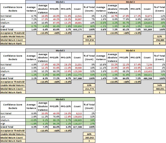
- Avg Variance [4] of 0.7% shows valuations that center very near the benchmarks, whereas lower confidence scores show a strong tendency to overvalue by 4-7%.
- Avg Absolute Variance [5] of 4.4% shows fairly tight (precise) valuations, whereas the other buckets are all double-digits.
- PPE10 [6] of 90% means that 90% of “high” confidence score valuations are within +/- 10%. Other confidence buckets range from 67% to even below 50%.
- PPE>20 [7] measures excessive overvaluations (greater than 20%), which can create very high-risk situations for lenders. In the “high” confidence bucket, they are almost nonexistent at 1.8%, but in other buckets they are 13%, 28% or even 31.6%.
This last metric mentioned is instructive. Model 1 is a very-high-performing AVM. However, in a certain small segment (about 3%), acknowledged by very low confidence scores, the model has a tendency to over-value properties by 20% or more almost one-third of the time.
The good news is that the model warns users of the diminished accuracy of certain estimates, but it’s up to the user to realize when to disregard those valuations. A close look at the table shows that with different models, there are different cut-offs that might be appropriate. Not every user’s risk appetite is the same, but we’ve highlighted certain buckets that might be deemed acceptable.
Model 2 and Model 5, for example, have very different profiles. Whereas Model 1 produced a majority of valuations with a “high” confidence level, Model 2 and Model 5 put very few valuations into that category. “Confidence scores” don’t have a fixed method of calculation that is standardized between Models. It’s possible that Model 2 and Model 5 use their labels more conservatively. That’s one more reason that users should test the models that they use and not simply expect them to perform similarly and use labels consistently.
That leads into a third conclusion that leaps out of this analysis. There’s a huge advantage to having access to multiple models and the ability to pick and choose between them. It’s not immediately apparent from this analysis, but these models are not all valuing the same properties with “high” confidence (this will be analyzed in two follow-up papers in this series). Model 4 is our top-ranked model overall. However, as shown in Table 2, there are tens of thousands of benchmarks that Model 4 valued with only “medium” or “low” or even “not rated” confidence but for which Model 1 had “high” confidence valuations.
Different models have strengths in different geographic areas, with different property types or even in different price ranges. The ideal situation is to have several layers of backups, so that if your #1 model struggles with a property and produces a “low” confidence valuation, you have the ability to turn to a second or third model to see if they have a better estimate. This last point is the purpose of Model Preference Tables®. They specify which model ranks first second and third across every geography, property type and price tranche. And, users may find that some models are only valuable as a second or third choice in some regions, but by adding them to the panel, the user can avoid that dismal dilemma: “Do I use this valuation that I expect is awful – what other choice do I have?”
[1] We grouped valuations as follows: <70% were considered “not rated,” 70-80% were considered “low,” 80-90% “medium,” and 90+ “high.”
[2] In fact, this isn’t wrong in some cases. For example, in the case of Model 2, the “medium” and “high” confidence valuations don’t differ significantly.
[3] The correlation coefficient indicates the strength of the relationship between two variables can be found using the following formula:
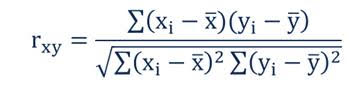
Where:
- rxy – the correlation coefficient of the linear relationship between the variables x and y
- xi – the values of the x-variable in a sample
- x̅ – the mean of the values of the x-variable
- yi – the values of the y-variable in a sample
- ȳ – the mean of the values of the y-variable
[4] Mean Error (ME)
[5] Mean Absolute Error (MAE)
[6] Percentage Predicted Error within +/- 10%
[7] Percentage Predicted Error greater than 20%, aka Right Tail Error