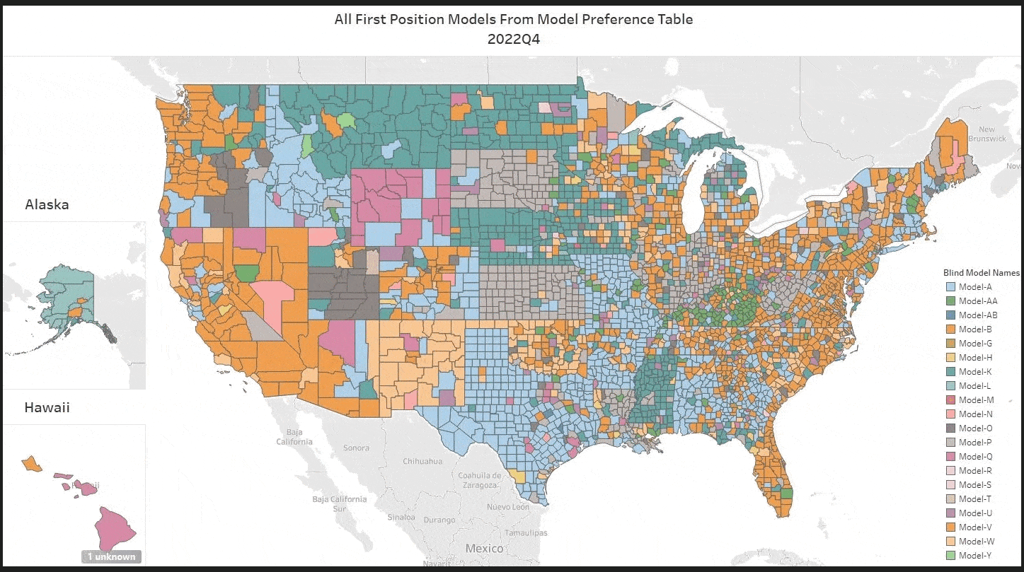
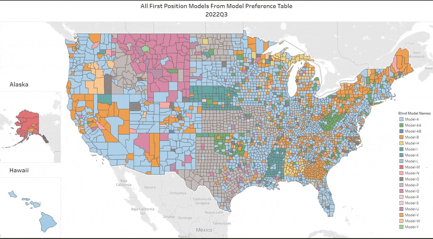
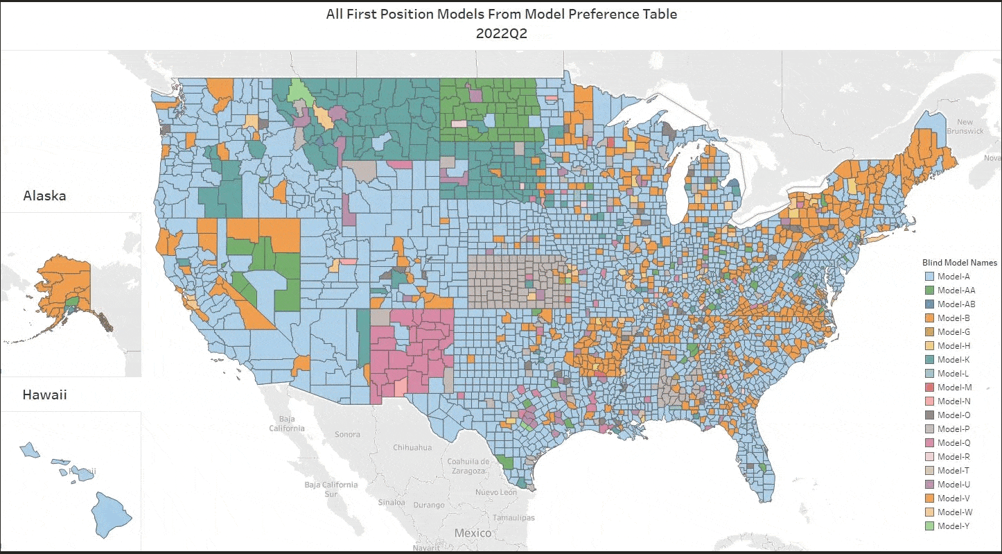
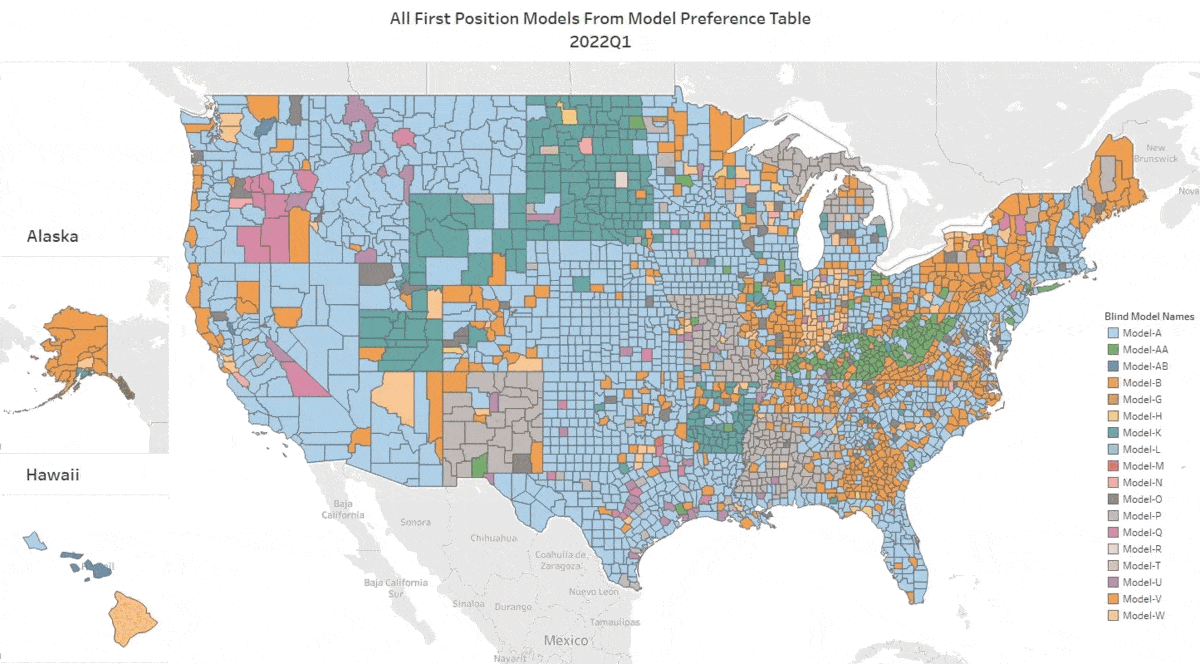
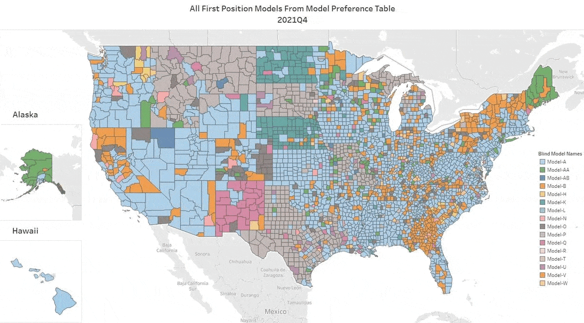
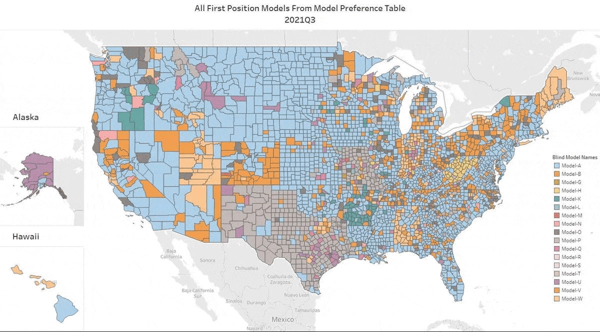
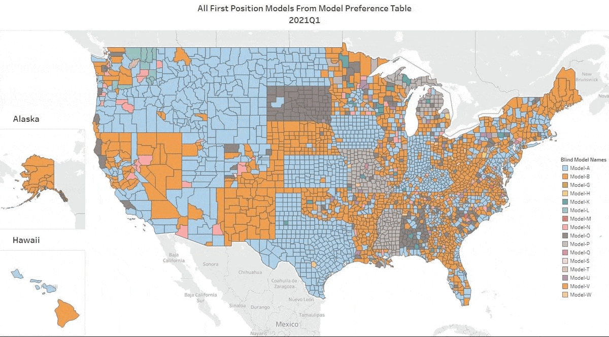
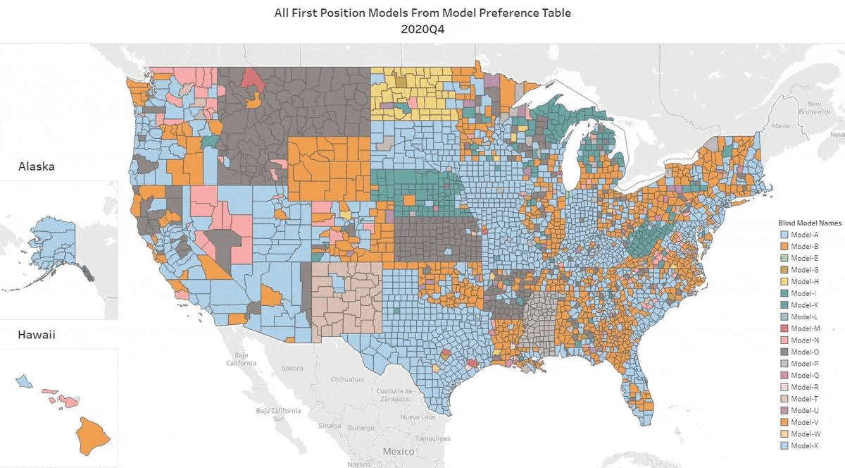
Every quarter we analyze all the top independently tested AVMs and compile the results. Click on this GIF to see the top AVM in each county for each quarter. As you watch the quarters change, you can see that the colors representing the top honors change frequently.
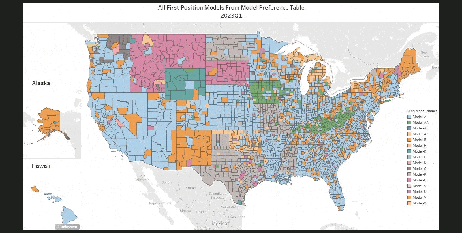
The main point is how frequently AVM performance changes. That should be no surprise, since market conditions change, and AVM’s have different strengths and tendencies. In Q4, AVMetrics independently tested 25 models; however, the GIF only highlights the 14 models that ranked in the top position of the MPTs. At least 11 AVMs shouldn’t be anyone’s first choice ANYWHERE, but they still have customers, presumably customers who don’t know the real performance of their AVMs. AVM Vendors and resellers are not Independent referees.
Independent testing is the only way to know how AVMs perform. Every model is constantly being improved as builders add new data feeds and use new techniques to get better results (with respect to new techniques, over at the AVMNews, we curate articles about AVMs, and we highlight several dozen new research articles about AVMs every year).
Q4 Change Highlights- Quarterly Trends Across the Coast
As ever, if you watch a part of the map, you’ll see several changes. The dynamics in Q4 really highlighted that achieving sustained stability at higher interest rate levels was a complex challenge. The heightened volatility we saw was a clear indicator that even as efforts were made to stabilize markets, the financial landscape remained fluid. It’s like watching a constantly shifting map—just when you think things have settled, new variables come into play. Here are some places to watch:
- In the Golden State, one of the highest priority counties in state has a new king, Los Angeles. Ventura, Orange, and San Diego counties also changes hands (just to name a few).
- Several less-populated states had almost wholesale changes, such as the Dakotas, Alaksa, Wyoming, Nebraska, Kansas and New Mexico.
- In the Sunshine State, models changed hands in several counties, including Palm Beach, Lee, Volusia, Flagler, and St. Johns.
Takeaways
Things change—a lot. Don’t rely on results from last year, earlier this year, or even last quarter! Markets evolve quickly, and often, 3 months of data are required to gather a large enough sample in smaller regions. But we can slice and analyze data in many different ways to get a clearer picture.
Use more than one AVM. It’s not always obvious from a map showing just one AVM per county, but if you consider what goes into producing those results, you’ll see that AVMs have different strengths. There are many competing to climb to the top of the rankings, so when valuing a property, you can’t be sure which AVM will be the best fit. When an AVM produces a result with low confidence, there’s a very good chance another AVM will provide a more reasonable estimate.
Use the right AVM for each use case and keep testing. Things change quickly and frequently, so staying adaptable and testing different models will help ensure you’re getting the best results.