Q4’s update is remarkable for the amount of change in the map. Every quarter we analyze all the top AVMs and compile the results. This GIF shows the top AVM in each county for each quarter, and as it spools through the quarters, you can see where the top honors change hands.
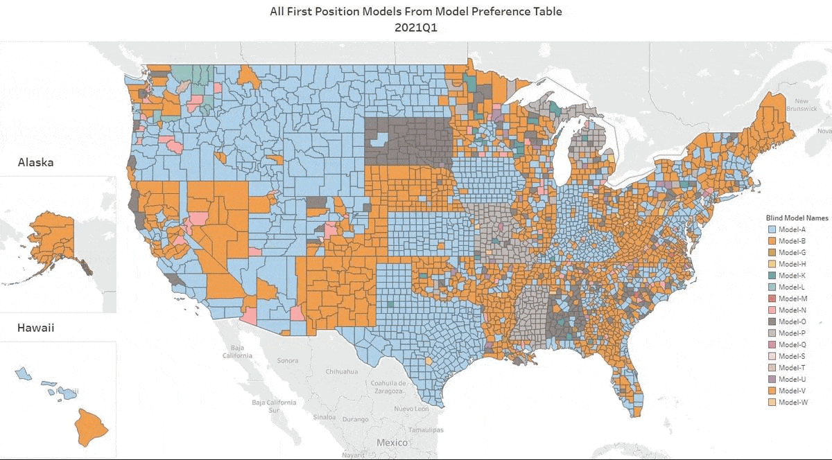
The main point is how frequently AVM performance changes. That should be no surprise, since market conditions change, and AVM’s have different strengths and tendencies. Phoenix has more tract housing, and some AVMs are optimized for that. Cities in the northeast have more row housing, and some models are better there. But AVMs also change – a lot. Whole new models are introduced, but every model is constantly being improved as builders add new data feeds and use new techniques to get better results. (With respect to new techniques, over at the AVMNews, we curate articles about AVMs, and we highlight several dozen new research articles about AVMs every year.)
Q4 Change Highlights
As ever, if you watch a part of the map, you’ll see several changes. But, in Q4, with markets changing significantly as interest rates rose and then fell, we saw a real upending of the order. Here are some places to watch:
- Most of the west coast changed from blue to the orange of Model B, except Orange County, ironically, which is tan for Model H.
- Seattle and Portland changed from blue to the Model B orange.
- Several upper Rocky Mountain states changed from pink to the green of Model K. (Visually it’s striking, but in terms of population, admittedly less important.)
- Almost every county in Utah changed.
- A lot of rural Texas changed from gray to the blue of Model A, so those guys took some territory back.
- But, Model A also gave away leadership in Chicago and the surrounding counties, which went from blue to orange (Model B) or tan (Model H).
- New York was completely shuffled. Surprisingly, the same changes held in NY City and upstate: counties changed from orange to blue (Model A got some more back), and those that were green or blue changed to orange or tan.
- All the counties around Washington D.C. went from blue to orange (Model B wins again).
- Just west of that, in West Virginia, everything changed from blue to the Kelly green of Model AA.
Takeaways
Things change – a lot. Don’t rely on the results from last year or earlier this year. Heck, you can’t even trust last quarter! We compile these results quarterly, but our testing is non-stop, and we can produce new optimizations monthly based on a rolling 3 months or any other time period. Often, 3 months’ of data are required to get a large enough sample in smaller regions, but we can slice it every way imaginable.
Use more than one AVM. It’s not obvious from a map showing just one AVM in each county, but if you think about what’s going on to produce these results, you’ll realize that AVMs have different strengths and there are a lot of them climbing all over each other to get to the top of the ranking. So, when you’re valuing a particular property, you just don’t know if it will be a good candidate for even the best AVM. When that AVM produces a result with low confidence, there’s a very good chance that another AVM will produce a reasonable estimate. Why not be able to take three bites at the apple?