Tag: AVMs

#1 AVM in Each County Updated for Q2 2024

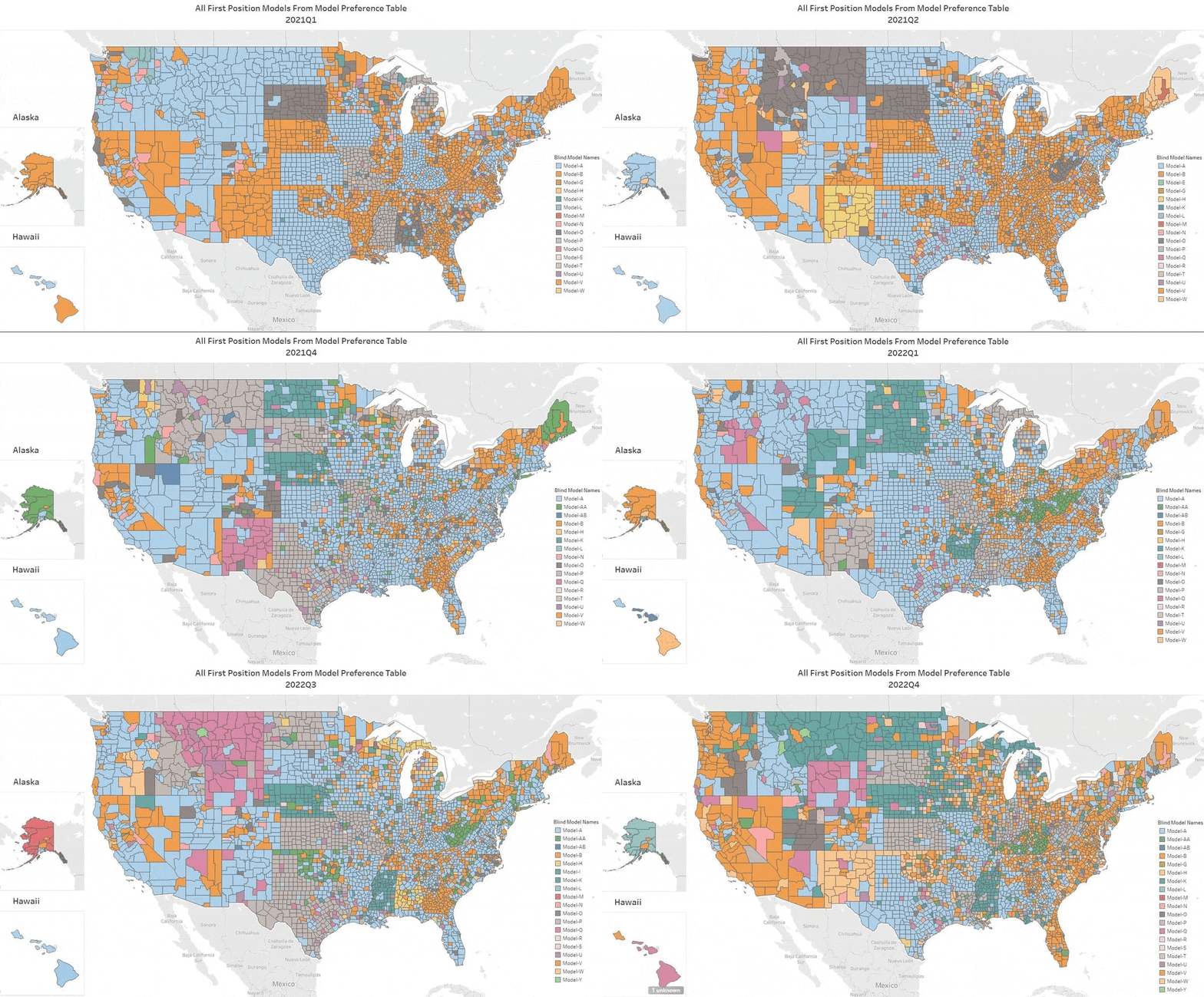
Every quarter we analyze all the top AVMs and compile the results. Click on this GIF to see the top AVM in each county for each quarter. As you watch the quarters change, you can see that the colors representing the top honors change frequently.
The main point is how frequently AVM performance changes. That should be no surprise, since market conditions change and AVM’s have different strengths and tendencies. Phoenix has more tract housing, and some AVMs are optimized for that. Cities in the northeast have more row housing, and some models are better there. But AVMs also change – a lot. Whole new models are introduced, but every model is constantly being improved as builders add new data feeds and use new techniques to get better results (with respect to new techniques, over at the AVMNews, we curate articles about AVMs, and we highlight several hundred new research articles about AVMs every year).

Q2 Change Highlights

As ever, if you watch a part of the map, you’ll see several changes. In Q2, we saw a changing of the guard. Here are some places to watch:

  1. In Texas, most counties changed leadership. The counties that include Austin and its suburbs changed leadership. Not Dallas, but most of the counties around Dallas, and not Houston (Harris), but most of the counties around Harris County changed leadership.
  2. Much of Alaska, and the West Coast changed leadership.
  3. Some less-populated areas had almost wholesale changes, such as Colorado, Nevada, New Mexico, the Dakotas, rural Michigan, Illinois, Missouris, Arkansas, Louisiana, Mississippi and more.

Takeaways

  1. Things change – a lot. Don’t rely on the results from last year. Heck, you can’t even trust last quarter! We compile these results quarterly, but our testing is non-stop, and we can produce new optimizations monthly based on a rolling 3 months or any other time period. Often, 3 months’ of data are required to get a large enough sample in smaller regions, but we can slice it every way imaginable.
  2. Use more than one AVM. It’s not obvious from a map showing just one AVM in each county, but if you think about what’s going on to produce these results, you’ll realize that AVMs are climbing all over each other to get to the top of the ranking. So, when you’re valuing a particular property, you just don’t know if it will be a good candidate for even the best AVM. When that AVM produces a result with low confidence, there’s a very good chance that another AVM will produce a reasonable estimate. Why not be able to take three, four or five bites at the apple?
Feds to Lenders: Take AVMs Seriously

Regulators are signaling that they are going to be looking at how AVMs are used and whether lenders have appropriately tested them and continuously monitor them for valuation discrimination. This represents a change in the focus on AVMs and the need for all lenders to focus on AVM validation to avoid unfavorable attention from government regulators.

On Feb 12, the FFIEC issued a statement on examinations from regulators. It specifically stated that it didn’t represent a change in principles, nor a change in guidance, and not even a change in focus. It was just a friendly announcement about the exam process, which will focus on whether institutions can identify and mitigate bias in residential property valuations.

Law firm Husch Blackwell published their interpretation a week later. Their analysis included consideration of the June 2023 FFIEC statement on the proposed AVM quality control rule, which would include bias as a “fifth factor” when evaluating AVMs. They interpret these different announcements as part of a theme, an extended signal to the industry that all valuations, and AVMs in particular, are going to receive additional scrutiny. Whether that is because bias is as important as quality or because being unbiased is an inherent aspect of quality, the subject of bias is drawing attention, but the result will be a thorough examination of all practices around valuation, including AVMs, from oversight to validation, training, auditing, etc.

AVM quality has theoretically been an issue that could be enforced by regulators in some circumstances for over a decade. What we’re seeing is not just an expansion from accuracy into questions of bias. We’re also seeing an expansion from banks into all lenders, including non-bank lenders. And, they are signaling that examinations will focus on bias, which is an expansion from the theoretical requirement to an actual, manifest, serious requirement.

#1 AVM in Each County Updated for Q1 2024

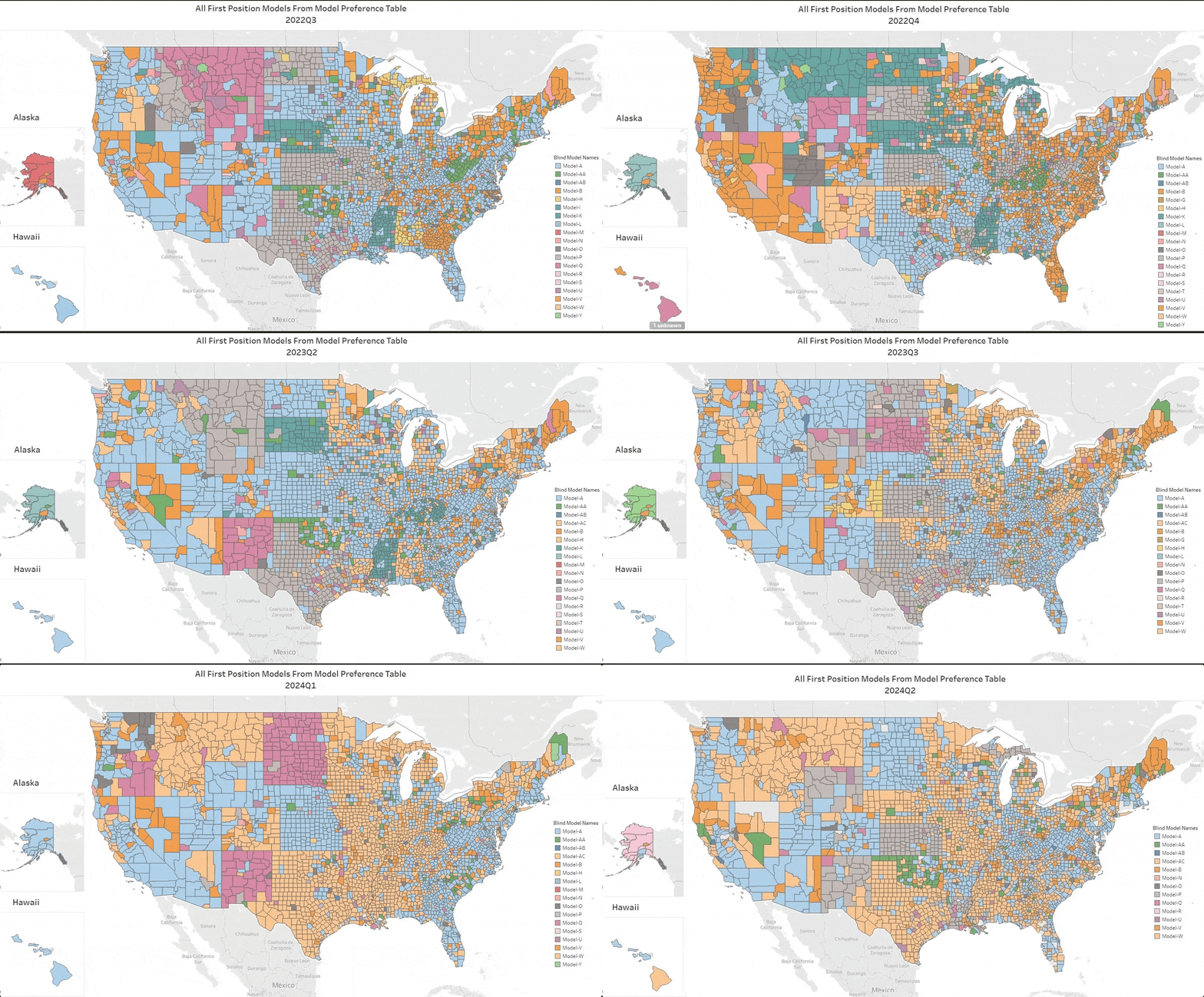
Every quarter we analyze all the top AVMs and compile the results. Click on this GIF to see the top AVM in each county for each quarter. As you watch the quarters change, you can see that the colors representing the top honors change frequently.

GIF that depicts a changing map of the United States with colors representing the #1 AVM in each county. Each quarter, the colors change reflecting the changing #1 AVM. They change frequently and dramatically, demonstrating how dynamic AVM performance is.
Click the map to see how the #1 AVM in each county changes frequently.

The main point is how frequently AVM performance changes. That should be no surprise, since market conditions change and AVM’s have different strengths and tendencies. Phoenix has more tract housing, and some AVMs are optimized for that. Cities in the northeast have more row housing, and some models are better there. But AVMs also change – a lot. Whole new models are introduced, but every model is constantly being improved as builders add new data feeds and use new techniques to get better results (with respect to new techniques, over at the AVMNews, we curate articles about AVMs, and we highlight several hundred new research articles about AVMs every year).

Q1 Change Highlights

As ever, if you watch a part of the map, you’ll see several changes. In Q1, markets continued to grind along with higher interest rates. We saw a changing of the guard. Here are some places to watch:

  1. In Texas, most counties changed leadership. The counties that include Austin and its suburbs changed leadership. Not Dallas, but most of the counties around Dallas, and not Houston (Harris), but most of the counties around Harris County changed leadership.
  2. Much of rural California, Oregon and Washington changed leadership.
  3. Some less-populated areas had almost wholesale changes, such as Colorado, Nevada, New Mexico, the Dakotas, rural Michigan, Illinois, Missouris, Arkansas, Louisiana, Mississippi and more.

Takeaways

  1. Things change – a lot. Don’t rely on the results from last year. Heck, you can’t even trust last quarter! We compile these results quarterly, but our testing is non-stop, and we can produce new optimizations monthly based on a rolling 3 months or any other time period. Often, 3 months’ of data are required to get a large enough sample in smaller regions, but we can slice it every way imaginable.
  2. Use more than one AVM. It’s not obvious from a map showing just one AVM in each county, but if you think about what’s going on to produce these results, you’ll realize that AVMs are climbing all over each other to get to the top of the ranking. So, when you’re valuing a particular property, you just don’t know if it will be a good candidate for even the best AVM. When that AVM produces a result with low confidence, there’s a very good chance that another AVM will produce a reasonable estimate. Why not be able to take three, four or five bites at the apple?
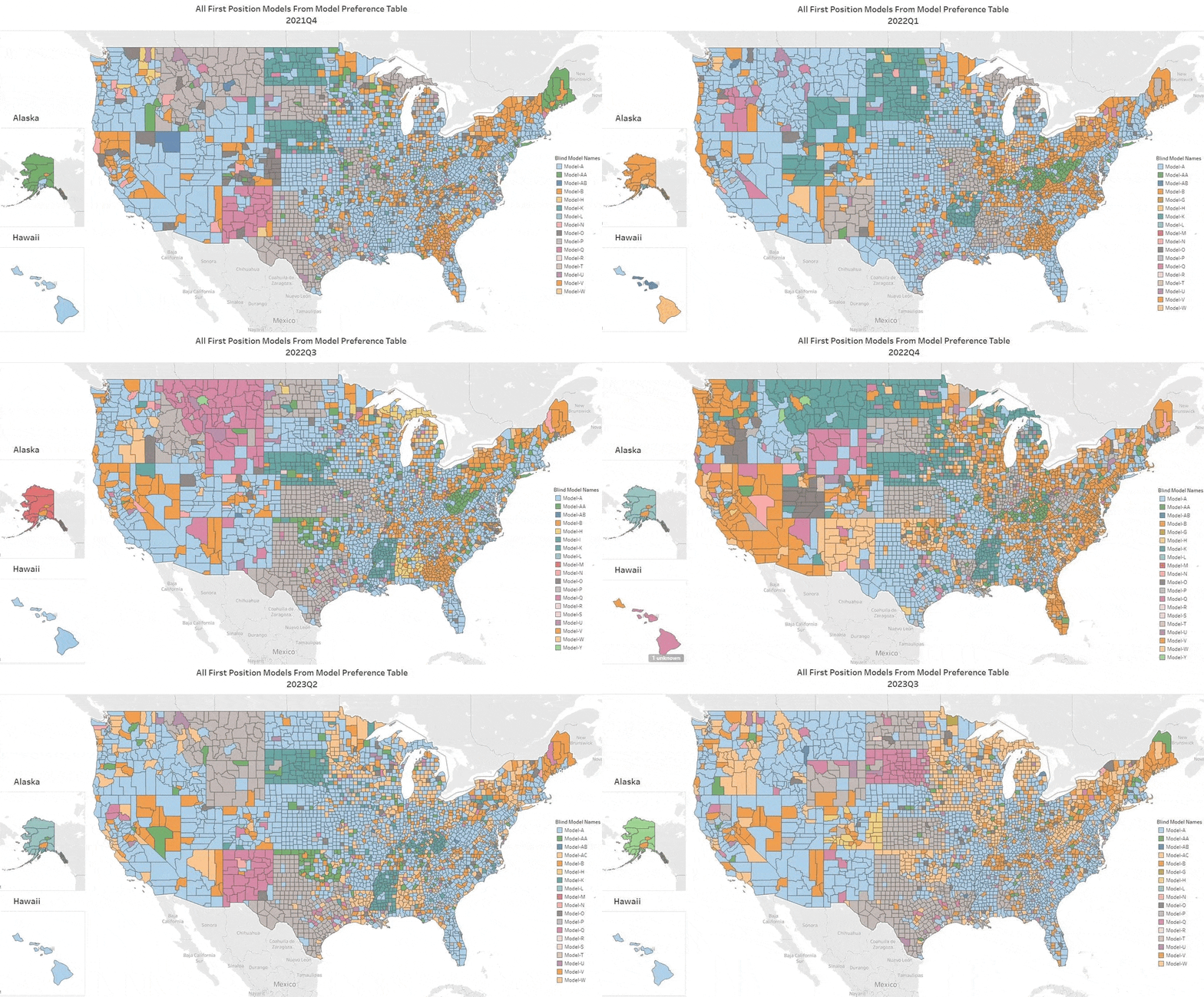
#1 AVM in Each County Updated for Q4 2023

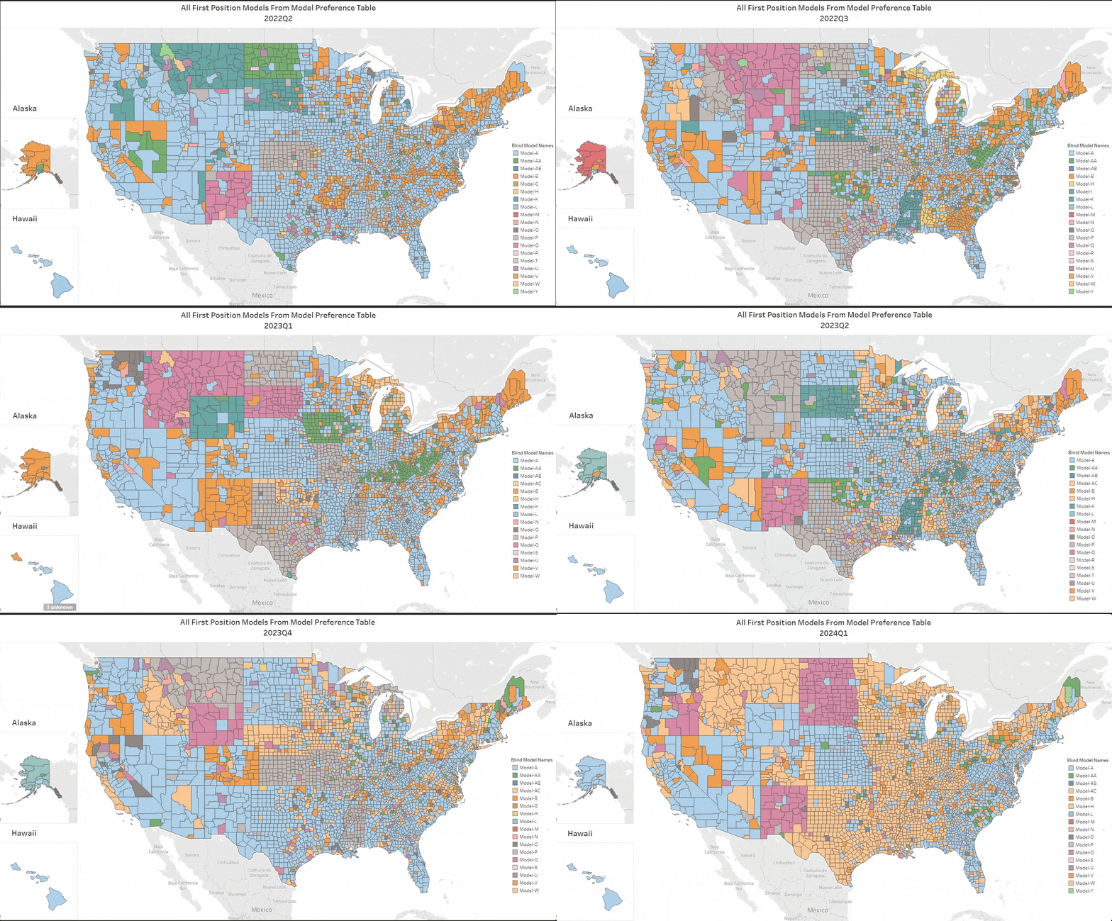
Every quarter we analyze all the top AVMs and compile the results. Click on this GIF to see the top AVM in each county for each quarter. As you watch the quarters change, you can see that the colors representing the top honors change frequently.

A gif showing the most recent 8 quarters of AVM performance with the #1 AVM in each county represented by a unique color
The number 1 AVM in each county for the last two years. Each AVM is represented by a unique color.

The main point is how frequently AVM performance changes. That should be no surprise, since market conditions change and AVM’s have different strengths and tendencies. Phoenix has more tract housing, and some AVMs are optimized for that. Cities in the northeast have more row housing, and some models are better there. But AVMs also change – a lot. Whole new models are introduced, but every model is constantly being improved as builders add new data feeds and use new techniques to get better results (with respect to new techniques, over at the AVMNews, we curate articles about AVMs, and we highlight several hundred new research articles about AVMs every year).

Q4 Change Highlights

As ever, if you watch a part of the map, you’ll see several changes. But, in Q3, as markets stabilized at higher interest rate levels, we saw a changing of the guard. Here are some places to watch:

  1. On the the west coast, leadership changed in Los Angeles County and Seattle’s King County.
  2. Most of the counties of Atlanta, GA changed, as did the main counties of Charlotte, NC.
  3. Some less-populated areas had almost wholesale changes, such as Idaho, the Dakotas, Montana, Colorado, Iowa and rural Michigan (but not New Mexico or Utah).

Takeaways

  1. Things change – a lot. Don’t rely on the results from last year or earlier this year. Heck, you can’t even trust last quarter! We compile these results quarterly, but our testing is non-stop, and we can produce new optimizations monthly based on a rolling 3 months or any other time period. Often, 3 months’ of data are required to get a large enough sample in smaller regions, but we can slice it every way imaginable.
  2. Use more than one AVM. It’s not obvious from a map showing just one AVM in each county, but if you think about what’s going on to produce these results, you’ll realize that AVMs have different strengths and there are a lot of them climbing all over each other to get to the top of the ranking. So, when you’re valuing a particular property, you just don’t know if it will be a good candidate for even the best AVM. When that AVM produces a result with low confidence, there’s a very good chance that another AVM will produce a reasonable estimate. Why not be able to take three, four or five bites at the apple?
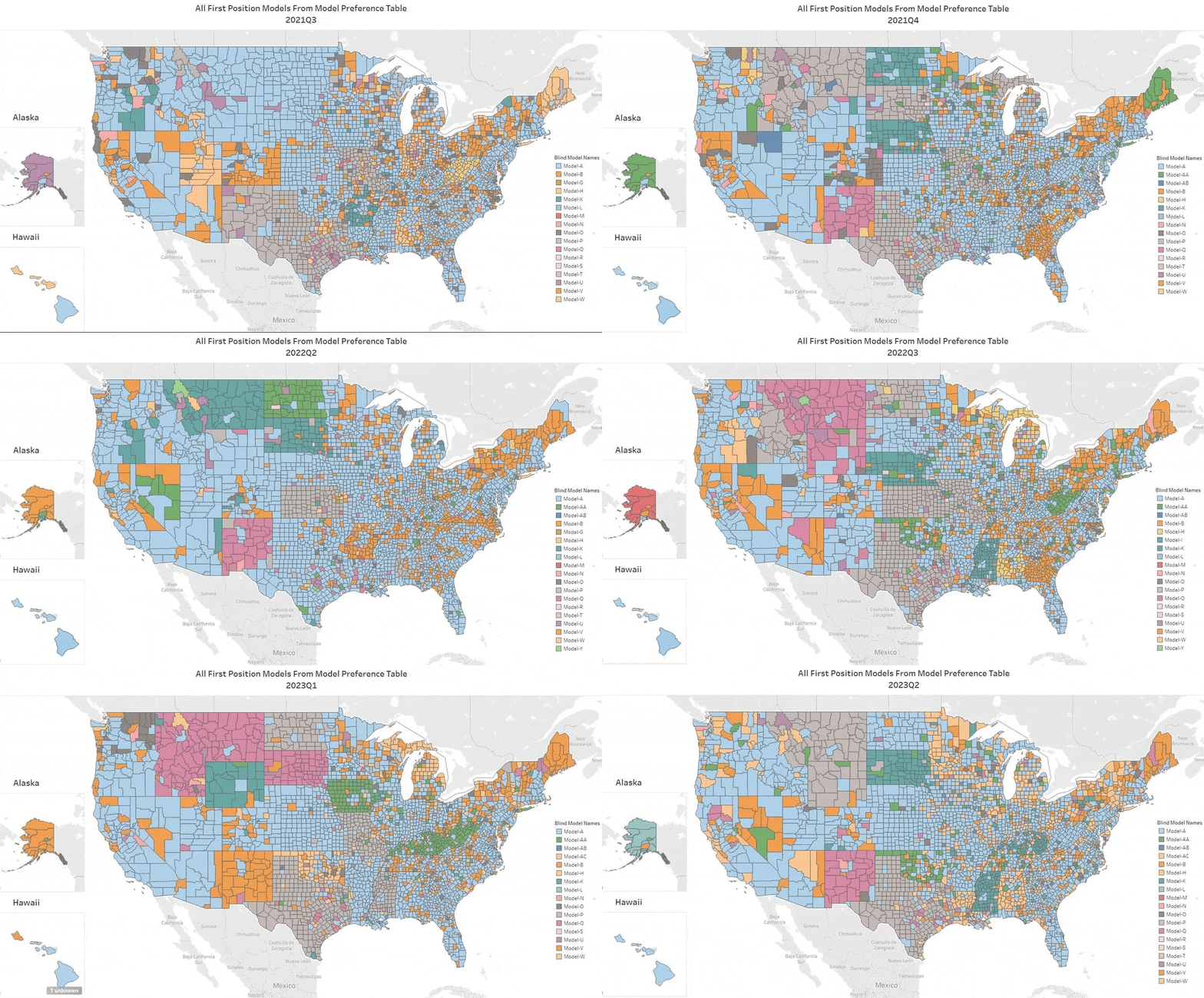
#1 AVM in Each County Updated for Q3 2023

Every quarter we analyze all the top AVMs and compile the results. Click on this GIF to see the top AVM in each county for each quarter. As you watch the quarters change, you can see that the colors representing the top honors change frequently.

map of the united states cycling between 8 images showing a different color for each AVM that is #1 in the county. The colors change rapidly and substantially indicating a very dynamic market where leadership as "the best AVM" changes a lot.
Q3 2023 update

The main point is how frequently AVM performance changes. That should be no surprise, since market conditions change, and AVM’s have different strengths and tendencies. Phoenix has more tract housing, and some AVMs are optimized for that. Cities in the northeast have more row housing, and some models are better there. But AVMs also change – a lot. Whole new models are introduced, but every model is constantly being improved as builders add new data feeds and use new techniques to get better results (with respect to new techniques, over at the AVMNews, we curate articles about AVMs, and we highlight several dozen new research articles about AVMs every year).

Q3 Change Highlights

As ever, if you watch a part of the map, you’ll see several changes. But, in Q3, as markets stabilized at higher interest rate levels, we saw a changing of the guard. Here are some places to watch:

  1. On the the west coast, leadership changed in Orange County and many smaller counties.
  2. Several less-populated states had almost wholesale changes, such as the Dakotas, Montana, New Mexico and Mississippi.
  3. Dozens of suburban counties changed around other metro areas, from Houston and Dallas to Chicago and D.C.

Takeaways

Things change – a lot. Don’t rely on the results from last year or earlier this year. Heck, you can’t even trust last quarter! We compile these results quarterly, but our testing is non-stop, and we can produce new optimizations monthly based on a rolling 3 months or any other time period. Often, 3 months’ of data are required to get a large enough sample in smaller regions, but we can slice it every way imaginable.

Use more than one AVM. It’s not obvious from a map showing just one AVM in each county, but if you think about what’s going on to produce these results, you’ll realize that AVMs have different strengths and there are a lot of them climbing all over each other to get to the top of the ranking. So, when you’re valuing a particular property, you just don’t know if it will be a good candidate for even the best AVM. When that AVM produces a result with low confidence, there’s a very good chance that another AVM will produce a reasonable estimate. Why not be able to take three bites at the apple?

#1 AVM in Each County Updated for Q2 2023

Every quarter we analyze all the top AVMs and compile the results. This GIF shows the top AVM in each county for each quarter, and as it spools through the quarters, you can see that the top honors change hands frequently.

map of the united states cycling between 8 images showing a different color for each AVM that is #1 in the county. The colors change rapidly and substantially indicating a very dynamic market where leadership as "the best AVM" changes a lot.
Click the image to see the GIF cycle between quarters.

The main point is how frequently AVM performance changes. That should be no surprise, since market conditions change, and AVM’s have different strengths and tendencies. Phoenix has more tract housing, and some AVMs are optimized for that. Cities in the northeast have more row housing, and some models are better there. But AVMs also change – a lot. Whole new models are introduced, but every model is constantly being improved as builders add new data feeds and use new techniques to get better results. (With respect to new techniques, over at the AVMNews, we curate articles about AVMs, and we highlight several dozen new research articles about AVMs every year.)

Q2 Change Highlights

As ever, if you watch a part of the map, you’ll see several changes. But, in Q2, as markets stabilized at higher interest rate levels, we saw a changing of the guard. Here are some places to watch:

  1. On the the west coast, leadership in Los Angeles, Silicon Valley and Seattle changed.
  2. Almost all of the Rocky Mountain states changed.
  3. Most of the counties around Washington D.C. and New York City changed. 

Takeaways

Things change – a lot. Don’t rely on the results from last year or earlier this year. Heck, you can’t even trust last quarter! We compile these results quarterly, but our testing is non-stop, and we can produce new optimizations monthly based on a rolling 3 months or any other time period. Often, 3 months’ of data are required to get a large enough sample in smaller regions, but we can slice it every way imaginable.

Use more than one AVM. It’s not obvious from a map showing just one AVM in each county, but if you think about what’s going on to produce these results, you’ll realize that AVMs have different strengths and there are a lot of them climbing all over each other to get to the top of the ranking. So, when you’re valuing a particular property, you just don’t know if it will be a good candidate for even the best AVM. When that AVM produces a result with low confidence, there’s a very good chance that another AVM will produce a reasonable estimate. Why not be able to take three bites at the apple?

Why Mark Sennott’s Whitepaper Stopped Us Cold

At AVMetrics, we have to admit having mixed feelings about Mark Sennott’s recent whitepaper on AVMs. We’re quite grateful for his praise on our testing, which he describes as “robust, methodical and truly independent.” He echoes some of our key concerns:

  • AVMs perform very differently, so it is important to test before using
  • AVM performance changes more frequently than you’d think
  • Everyone should employ a cascade using multiple AVMs, because it dramatically increases the accuracy of the delivered results.

However, there was something quite disconcerting in Mark’s telling of how AVMs are being used. In Mark’s words:

In practice, however, the top performing AVMs, based on independent testing performed by companies like AVMetrics, are not always the ones being delivered to lenders. The reason: self-interest on the part of the AVM delivery platforms who also sell and promote their own AVMs.

This very troubling delta between posture and operating practice had to be confronted first-hand by one of the lenders for which I provide guidance. What at first blush appeared as a straightforward exercise for the lender in vetting a platform provider’s cascade against AVMetrics independent testing results, became a ponderous journey to overcome contractual headwinds against a simple assurance the provider would indeed provide the highest scoring AVM model per AVMetrics recommendations. This was not the first time I experienced this apparent conflict of interest.

Kudos to Mark for writing openly about a practice that many in the industry would probably prefer that he kept quiet about.

#1 AVM in Each County Updated for Q4 2022

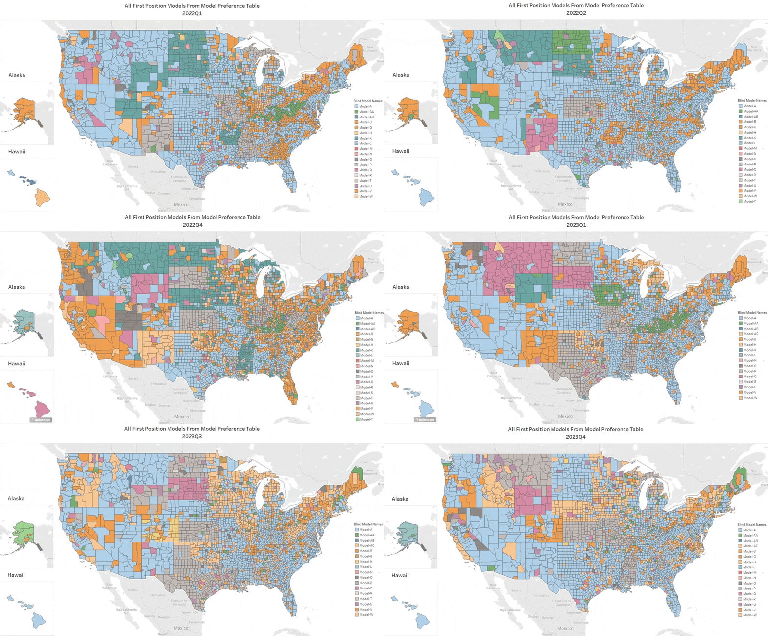
Q4’s update is remarkable for the amount of change in the map. Every quarter we analyze all the top AVMs and compile the results. This GIF shows the top AVM in each county for each quarter, and as it spools through the quarters, you can see where the top honors change hands.

Map of the united states in which every county is a color representing the best AVM according to the legend. Every second the map updates to the next quarter, starting in Q1 of 2021 and going through 7 updates to Q4 of 2022. The colors change quite rapidly, showing a lot of dynamism in the AVM rankings.
Click the image to see all eight quarters of 2021 and 2022. The number one AVM in each county is represented by its corresponding color in the legend.

The main point is how frequently AVM performance changes. That should be no surprise, since market conditions change, and AVM’s have different strengths and tendencies. Phoenix has more tract housing, and some AVMs are optimized for that. Cities in the northeast have more row housing, and some models are better there. But AVMs also change – a lot. Whole new models are introduced, but every model is constantly being improved as builders add new data feeds and use new techniques to get better results. (With respect to new techniques, over at the AVMNews, we curate articles about AVMs, and we highlight several dozen new research articles about AVMs every year.)

Q4 Change Highlights

As ever, if you watch a part of the map, you’ll see several changes. But, in Q4, with markets changing significantly as interest rates rose and then fell, we saw a real upending of the order. Here are some places to watch:

  1. Most of the west coast changed from blue to the orange of Model B, except Orange County, ironically, which is tan for Model H.
  2. Seattle and Portland changed from blue to the Model B orange.
  3. Several upper Rocky Mountain states changed from pink to the green of Model K. (Visually it’s striking, but in terms of population, admittedly less important.)
  4. Almost every county in Utah changed.
  5. A lot of rural Texas changed from gray to the blue of Model A, so those guys took some territory back.
  6. But, Model A also gave away leadership in Chicago and the surrounding counties, which went from blue to orange (Model B) or tan (Model H).
  7. New York was completely shuffled. Surprisingly, the same changes held in NY City and upstate: counties changed from orange to blue (Model A got some more back), and those that were green or blue changed to orange or tan.
  8. All the counties around Washington D.C. went from blue to orange (Model B wins again).
  9. Just west of that, in West Virginia, everything changed from blue to the Kelly green of Model AA.

Takeaways

Things change – a lot. Don’t rely on the results from last year or earlier this year. Heck, you can’t even trust last quarter! We compile these results quarterly, but our testing is non-stop, and we can produce new optimizations monthly based on a rolling 3 months or any other time period. Often, 3 months’ of data are required to get a large enough sample in smaller regions, but we can slice it every way imaginable.

Use more than one AVM. It’s not obvious from a map showing just one AVM in each county, but if you think about what’s going on to produce these results, you’ll realize that AVMs have different strengths and there are a lot of them climbing all over each other to get to the top of the ranking. So, when you’re valuing a particular property, you just don’t know if it will be a good candidate for even the best AVM. When that AVM produces a result with low confidence, there’s a very good chance that another AVM will produce a reasonable estimate. Why not be able to take three bites at the apple?